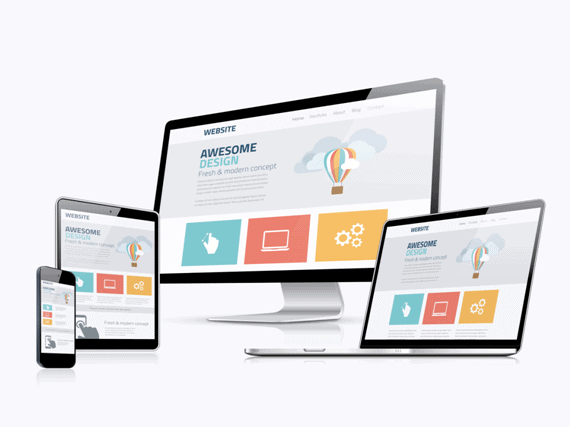
What does it take to create an appealing professional website? This question comes naturally if you’re building the website and have no experience in web design at all. Now, what are your options here? You may either hire an experienced designer to do the job for you or you can surf the Web, check what successful brands are doing and try to implement parts of their design strategy on your website. Whatever you choose, it would be wise to be familiar with some of the best design examples on the Internet, so spare a minute to go through these professional looking websites. Ready? Let’s go!

Have you Heard about Facebook?
Unless you’ve been successfully hiding under the rock for the past decade or so, you’re well aware of how Facebook has managed to change the online world. Since 2004, when the company was founded, Facebook succeeded where others before it crumbled.
One reason why Facebook is so well-recognized in the world is due to their unique design identity. But don’t let this fool you – Facebook was not Queen of the Prom when it showed up. By hiring talented designers who knew how to think out-of-the-box, Facebook evolved into a super powerful, world-leading social network.
Since Facebook has so many different sub products like Messenger and Camera, they’ve decided to develop separate visual strategies for each of these sub-brands. People from Facebook figured out that visual brand has to both anchor the company’s identity and stay flexible for whatever comes next. Facebook hit the center of the target with their original-looking favicon and new icons created for every single sub-brand.
According to statistics, as of the third quarter of 2017, Facebook had 2.07 billion monthly active users. That means that almost every fourth person in the world has a personal Facebook profile. It looks like they know what they’re doing.
What hides behind Amazon’s success?
The world of social networks has become extremely important for humans and the number of social networking sites is growing bigger by the minute. But what about online shopping? Let’s face it, the great majority of online businesses are selling something, whether it be products or services.
If we take a better look at online shopping, we’ll get to the conclusion that commerce was reborn online. One of the best examples for this claim is Amazon. Founded in 1994, this multinational online company is listed as world’s number one internet company by revenue and market capitalization, with an astonishing $136 billion in 2016.
Mega competitive online shopping market demands companies to have a top-quality brand identity. Started as an online bookstore, Amazon has developed a vast array of mutually independent sub-product lines, which all have separate visual identities.
Product, source and endorsing brand architectures, modern design with futuristic outlook, personalized pages, and a customer-friendly interface have helped Amazon to become what it is today – a visual identity role model.
Why is AskGamblers so popular?
Fun brings joy to our lives. Therefore, playing games and online slots is a good way to relax and enjoy your free time after a hard-working business day. Homepage of AskGamblers world’s best online casino website, is an excellent example of an effective design strategy realized through simplicity.
With their sleek, eye-catching template, AskGamblers primarily emphasize vital information related to the iGaming industry. However, the efforts they put into their graphic solutions doesn’t go by unnoticed.
Thanks to their complete visual identity, including the master brand, colour palette, typography, imagery, and graphic style, AskGamblers conveyed the company’s culture, personality and core brand value in the best possible way.
Keep the above mentioned, wisely chosen visual identity strategies in mind when you decide to start your own online business. Be creative. Be brave. Good luck.
 Gearfuse Technology, Science, Culture & More


