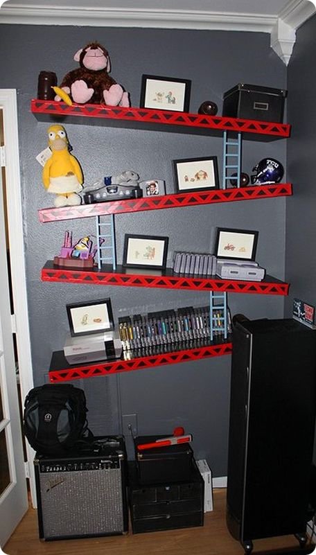
Asymmetry is a big no-no in the world of interior design. But much like any other rule, there are exceptions. This Donkey Kong shelving idea is definitely not symmetrical, but the dash of gaming culture it adds is SO worth it.
Anyway, the asymmetrical parts sort of cancel each other out. Am I right? It brings Donkey Kong from the screen, to the streets, and back to your wall.
Link [via]
 Gearfuse Technology, Science, Culture & More


