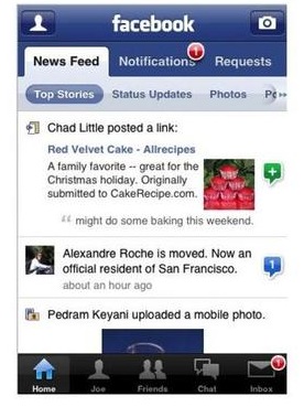
So yeah, while I’m addicted to Facebook, I don’t have an iPhone. But alas, I hear many good things about the just-released Facebook 2.0 application for the iPhone. From the above screenshot, it looks just like the web-based version. But why speculate? I turned to Boggle master/blogger Andrea Rosen to find out:
VV: You just downloaded the app. First impressions?
Rosen: The old app only allowed you to look at status updates in your news feed. I’m glad they waited for the Facebook redesign to add more to the main feed–the new navigation options (separating your news feed into sections) are really phone-friendly–it makes everything easier to digest.
VV: How’s the navigation? Much easier than before? Any complaints?
Rosen: You can also access notifications, which is new and makes checking your wall posts, tagged photos much simpler on the go. My main complaint about the former iteration of the app was that you couldn’t see all of a user’s tagged photos. Now you can and the navigation is much like the iPhone’s own photo browse application. Overall, this is a massive improvement.
VV: What’s a “Downtown Julie Brown?”
Rosen: A vagina.
There you have it! One of the best vagina-based apps on the market!
Link [via]
 Gearfuse Technology, Science, Culture & More


It might have something to do with the length of the posts currently on the main page. ,