Ask Facebook nicely and it will draw you a picture of the world in its image. But you have to know the right questions.
Facebook intern Paul Butler explains how he framed the queries that gave him the data he needed to create map of Facebook’s global footprint (click on the image for a larger version):
I began by taking a sample of about ten million pairs of friends from Apache Hive, our data warehouse. I combined that data with each user’s current city and summed the number of friends between each pair of cities. Then I merged the data with the longitude and latitude of each city.
(Note that Butler’s data set includes some twenty million people�only about five percent of Facebook’s total membership.)
…. To my relief, what I saw was roughly an outline of the world. Next I erased the dots and plotted lines between the points. After a few minutes of rendering, a big white blob appeared in the center of the map. Some of the outer edges of the blob vaguely resembled the continents, but it was clear that I had too much data to get interesting results just by drawing lines. I thought that making the lines semi-transparent would do the trick, but I quickly realized that my graphing environment couldn’t handle enough shades of color for it to work the way I wanted.
Instead I found a way to simulate the effect I wanted. I defined weights for each pair of cities as a function of the Euclidean distance between them and the number of friends between them. Then I plotted lines between the pairs by weight, so that pairs of cities with the most friendships between them were drawn on top of the others. I used a color ramp from black to blue to white, with each line’s color depending on its weight. I also transformed some of the lines to wrap around the image, rather than spanning more than halfway around the world.
Butler’s assumptions and calculations are elegant, and awesomely effective. He’s done a great job of painting a picture of Facebook’s virtual global village�one which, if his choices represent the whole accurately enough, also reveals the limits of the Facebook empire. Voids pop up for Brazil (where Orkut reigns), Russia and much of continental Asia, and the interior of Africa.
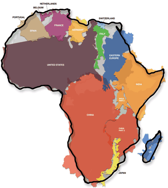
With maps, lacunae like these�”unknown unknowns” revealed�tell stories as eloquently as positive data. And comparisons take the story further. Check out this brilliant map by Kai Krause, laying down various nations (many of them coincidentally Facebook-rich) within the outline of Africa (click for a larger version with explanatory text):

It’s a vast land mass, Africa. And yet to Facebook, it remains an undiscovered continent.
We keep discovering that the world isn’t flat.
 Gearfuse Technology, Science, Culture & More


