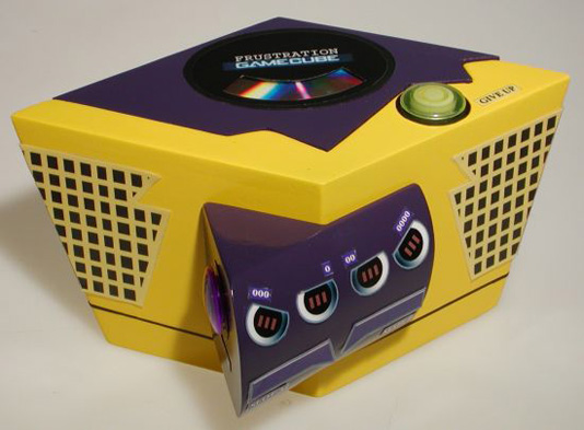
We’re not saying that GameCube was the smoothest gaming console to begin with (or even one of our top 5 choices) but it was certainly nowhere near as irritating as the purposely frustrating Frube. Even the colors chosen for this device are annoying as hell.
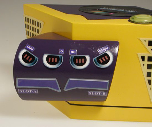
The Frube gives the GameCube a new parallelogram shape which makes the system almost impossible to fit on a spare spot on the shelf in any sort of comfortable way. The Frube also features a set of asymmetrical controller ports and a jaggedly cut disc opening flap which helps confuse the users even further. Of course this all depends on whether a user still has his sight after gazing eyes on the yellow and purple color clash.
�
Link [via]
 Gearfuse Technology, Science, Culture & More


