 Look up… no, not at the ceiling. Look at the top of the window you’re reading this in. Do you see that top bar with the URL in it? That’s an address bar. It’s been part of web browser design for about as long as the Internet has been around. Most of you know this, but it’s nice to educate the new folks. Regardless, if Google has their way, its Chrome browser will soon do away with the address bar.
Kind of.
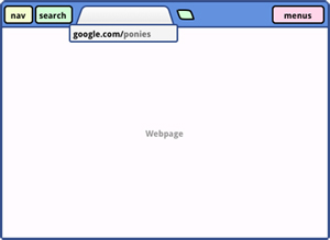
With Google’s idea for “Compact Navigation” the address bar would be hidden from view, leaving a single row at the top of the window that has menu and navigation buttons along with your tabs. When you wanted to change a webpage, you’d click on the tab and a small address bar would appear underneath the tab.
From the Google description:
If we take the address bar out of the tab, it can be used as both a launcher and switcher; the user doesn’t have to worry about replacing their active tab. The current url shows while a site is loading, and can be edited or changed by clicking on the tab.
This is far from being final. In fact, it’s one of a few designs that are being considered by Google, which also includes a new layout that moves the tabs to a vertical sidebar. While this would allow for sorting by dates and grouping, Google notes that it would be a huge waste of space for those of us who don’t frequently have a dozen tabs open.
Google Chrome has been my browser of choice for some time, though recently I’ve been giving Internet Explorer 9 a fair go. If these changes were to occur, I would gladly jump back into the Chrome camp.
 Gearfuse Technology, Science, Culture & More


this is interesting cant wait to see latest version now.