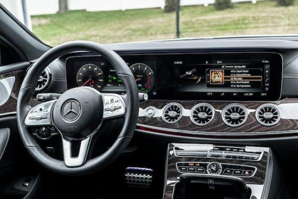
Not so long ago, bold design ideas about dynamic screens instead of standard “wells” seemed just a beautiful fairy tale from the distant future
It is well known that the automobile industry has been swinging for quite some time. This is especially true for cardinal concerns such as interfaces. However, all changed with the introduction of the Tesla Model S in 2012. For the first time, a massive 17-inch tablet was placed in the heart of the torpedo. The second, smaller panel presented the necessary information for the driver, such as speed, distance, and consumption. And everyone suddenly thought: “Why not?” After this, HMI UI/UX Design began to smoothly leak into the real world.

Pioneers
Manufacturers began competing to develop brilliant cluster designs at vehicle exhibits. Visteon Innovation & Technology GmbH Ralf collaborated with Breninek (Pixelasm) to create a hybrid interface using physical arrows and a digital screen for CES 2015. The majority of the animation was done in Cinema 4D and assembled in After Effects.
In 2016, they also attempted to push the frontiers of hardware and software synthesis by utilizing a specialized Kanzi software package. Kanzi is a multi-platform editor for creating interfaces and animations for embedded devices. In particular, car instrument displays and infotainment systems.
Kanzi’s technology is now employed in models from 25 different automobile manufacturers, including at least ten Audi models. And it’s a lot.
Audi, BMW, and Mercedes vehicles provide the most modern screens available today. Audi introduced the A3 with a digital display, while Mercedes just unveiled the new generation Gelandewagen with comparable “instruments”.
HMI of other vehicles
The hand of interface designers reached out to fighter jets and yachts. It turned out that it is quite possible to use familiar screens there. This means that the design for them can also be done using a standard graphics program.
Aviation interfaces are divided into driver interfaces (for the pilot) and entertainment interfaces (for passengers). There are still very few driving concepts; specific knowledge is still required. But the passenger ones are already very similar to ordinary tablets.
How to Design an Automotive HMI
Text is a very important element of user interface design. Its use is an opportunity to test the level of basic designer skills.
- Font selection.
- Font size.
- Rules for choosing font color.
- Font weight.
- Font line height.
Color specifications for automotive HMI systems traditionally include a brand color, a meaningful color, and a neutral color.
Brand color, also known as “accent color”. Typically an HMI system has only one signature color, which is also a high-frequency color. The main scenarios for using accent color: are indication of switching tabs and button states, animation of the soundtrack when playing music, etc.
Semantic color needs to be brought into the user interface, tied to the precise expression of the information being conveyed. In complex scenes, the color trend should be very obvious to the user – this will help reduce the effort of understanding the meanings of colors and the time spent gaining this understanding, and also add a pinch of good driving experience to the travel experience.
Neutral color. Mainly used not only for text but also for things like background color, dividing lines, gray fill, borders and strokes, etc.
Note: When you change the background color, the other system colors follow it, representing a switch between two different sets of color specifications.
Avoid using the same color scheme for interactive and non-interactive elements – if interactive and non-interactive elements have the same color, it can be difficult to know where to click. Maintain color consistency – do not use randomly different colors to differentiate the appearance of duplicate components within the same screen. If these colors do not add any meaning to the elements and do not have objective value, use them with extreme caution.
Conclusion
The future belongs to digital devices. They allow you to change the composition of the information on the screen depending on the situation and display much more useful data to the driver. Soon, we can expect more bold and individual experiments with on-screen graphics in cars.
 Gearfuse Technology, Science, Culture & More


